Change Conversations blog

Brad Pettengill

Brad Pettengill

In addition to his role on our team as senior designer and art director, Brad is a professional photographer and long-time Kung Fu instructor. With all that fodder for blogging, Brad narrows his focus to write about design and balance in graphics, photography and life outside work.

Recent posts by Brad Pettengill

3 min read

Logo, Corporate Identity or Brand — What’s the Difference?

By Brad Pettengill on 9/28/17 10:00 AM

Logo, Corporate Identity or Brand — What’s the difference? When a company begins to consider ways to visually represent themselves, their product, service or idea, these terms are sometimes used interchangeably. There are significant differences though, and building a solid understanding of these three terms is valuable for every marketer.

6 min read

Basic Quality Control for your Brand Image

By Brad Pettengill on 8/31/17 10:00 AM


It’s a familiar problem. You have invested a great deal of time and money to create a strong visual identity for your mission-driven organization. But the stuff that’s out there in the public eye representing you is not consistent: colors don't match, your logo is stretched or fuzzy, or your promotional materials appear disjointed and don't speak with one voice. So your brand is compromised. Which can lead to doubt, distrust and lack of confidence in the quality of your service or product. How do you prevent it?

4 min read

Recycling Green Without Greenwashing

By Brad Pettengill on 8/17/17 10:56 AM

As a boy scout in the early seventies, I walked door-to-door soliciting support for S.O.A.R., Save Our American Resources, in the form of money pledged per mile of an upcoming 25-mile bike ride. I drew the ecology symbol on my school notebook and remember being moved by the iconic “Native American with a tear” commercial on broadcast TV. I pored over the Whole Earth Catalog, grew up among hippies, was fascinated with solar power and Buckminster Fuller, participated in roadside trash cleanups, and dreamed of a litter-free future devoid of air and water pollution. Arthur C. Clarke and other forward-thinking science fiction authors inspired me to think of worlds where starships roamed the galaxy in perfectly controlled environments and human greed and carelessness were a thing of the past. You could safely label me “green.”

6 min read

A Vermont designer’s marketing observations in Morocco

By Brad Pettengill on 7/27/17 10:00 AM


For her recent birthday, my wife wanted to wake up in an exotic location. She wanted to experience Morocco, despite the warnings from friends and family about "that part of the world" in this current geopolitical climate. Nevertheless, she persisted, and soon we were poring over printouts from Google Earth, planning the route that would take us around the entire country in seven days.

9 min read

How to work with your designer to get the best logo design

By Brad Pettengill on 6/29/17 10:00 AM

5 min read

Vision Changes: Typography for Aging Audiences

By Brad Pettengill on 3/23/17 10:00 AM


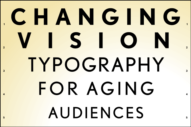
A reader recently responded to my blog post Typeface Choice: Ask yourself Three Questions, by raising an important series of questions on changing vision, information accessibility and type readability for an aging population. The reader works for a nonprofit community support agency that is developing outreach materials for rural seniors, adults with disabilities, caregivers and potential volunteers, and wanted advice on the best typeface to use to “keep the printed conversation going with our target population.”

4 min read

Which works best for changemakers—Illustration or Photography?

By Brad Pettengill on 2/23/17 10:00 AM


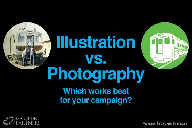
You need visual impact for your upcoming, mission-driven campaign or promotion. Which will work harder for you— illustration or photography? The short answer is, whatever your marketing professional’s research shows will appeal most to your target audience. This research can include customer age, income, education, nationality, gender, political leanings, lifestyle, buying history, and more. There are many other factors, though, such as the look and feel of your campaign, your brand story, the specifics of your marketing efforts. Every situation is unique, but here are some guidelines.

3 min read

Design for Activism

By Brad Pettengill on 1/26/17 10:30 AM


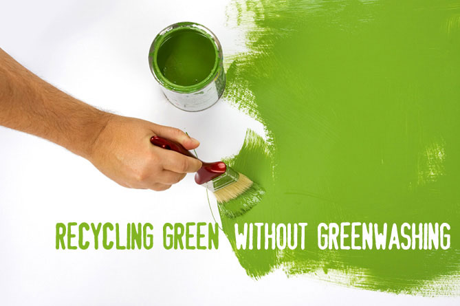
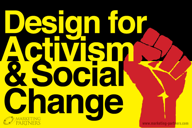
Whether you are marketing a product to improve the environment using triple bottom line principles, working on a campaign to increase awareness of your socially responsible community service organization, or rallying support for your ideas for change using grass roots activism, impactful design will play a critical role in your success.

6 min read

How to Achieve Marketing Consistency in Your Materials

By Brad Pettengill on 10/20/16 10:54 AM


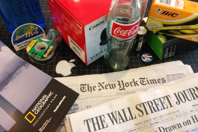
So you’ve decided to invest in a multi-faceted, multi-channel marketing campaign. Your presence, message and branding will appear in many channels—online ads, a website, a video on your website, newspaper ads, magazine print ads, signage, brochures, etc. Wondering how you will achieve a consistent look across all these iterations, and what just exactly is "marketing consistency" anyway? 

4 min read

Why should your nonprofit invest in good design?

By Brad Pettengill on 9/15/16 11:00 AM


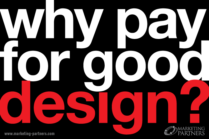
Why should your nonprofit invest in good design? Your mission is pressing, the needs are great — why spend money on design when it seems like it would be better spent on something that has a more direct effect on your customer. Here’s why. Good design is universally understood and people respond to it.

Good design sells. Whatever you’re selling or promoting.

7 min read

10 Effective Design Principles You Need to Know

By Brad Pettengill on 7/21/16 11:00 AM


Whether you’re creating a new page design for your website, an online ad, print brochure or an infographic, many of the same design principles apply. Color choice, use of shapes, and page layout or composition can make or break your marketing’s effectiveness. The difference between putting information on a page and actually making it visually appealing and effective so it works well for your marketing, is a singular focus on visual hierarchy or eye path.

5 min read

Marketing with Color: The Good, the Bad, the Ugly

By Brad Pettengill on 6/30/16 11:30 AM


Last week I ran across a New York Times article detailing one marketing research company’s process to determine the ugliest color in the world. The winner, Pantone 448, was voted ugliest color in a survey of 1,000 smokers. As the article reports, “It was described as looking like death, filth, lung tar or baby excrement…” The purpose of this was to use that color in a social marketing campaign against tobacco—to get people to associate ugliness with tobacco use, to reinforce its detrimental health affects in a visual and subconscious way.

Yet some people have positive associations of "chocolate candy" for any dark brown color. How can you and your team decide on the best combination of marketing with color and effectiveness for your next project?

Check out our Guide to Inclusive Language to help you communicate
  • There are no suggestions because the search field is empty.

About Change Conversations

The Change Conversations blog is where changemakers find inspiration and insights on the power of mission-driven communication to create the change you want to see.

Featured

Creative Commons

Creative Commons

© 2009- to present, Marketing Partners, Inc. Content on the Change Conversations blog is licensed under a Creative Commons Attribution-Noncommercial-NoDerivs 3.0 United States License to share as much as you like. Please attribute to Change Conversations and link to ChangeConversations.

Creative Commons License may not apply to images used within posts and pages on this website. See hover-over or links for attribution associated with each image and licensing information.