 Brad Pettengill
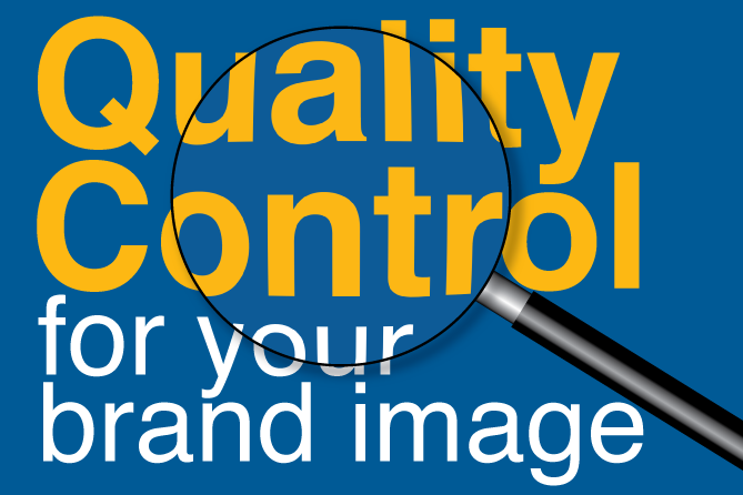
Oops! How to Prevent Bad News Results When the Media Calls
A media call feels urgent — but it usually isn’t. Taking a few minutes to get your bearings can be the difference between a quote you’re proud of and...

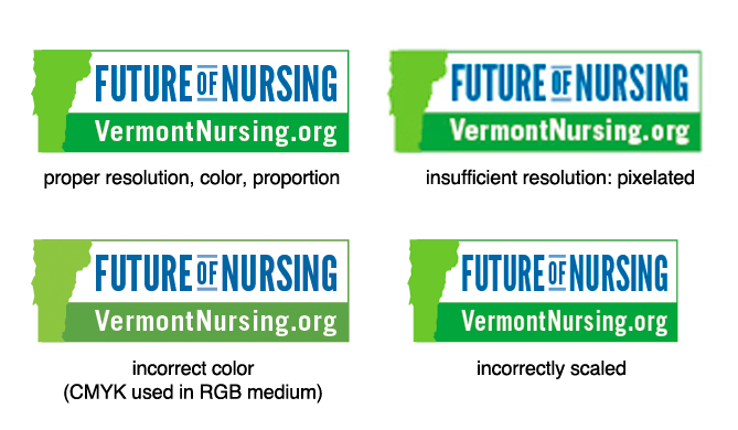
It’s a familiar problem. You have invested a great deal of time and money to create a strong visual identity for your mission-driven organization. But the stuff that’s out there in the public eye representing you is not consistent: colors don't match, your logo is stretched or fuzzy, or your promotional materials appear disjointed and don't speak with one voice. So your brand is compromised. Which can lead to doubt, distrust and lack of confidence in the quality of your service or product. How do you prevent it?
Managing multiple vendors, media outlets, creative contractors and your staff to maintain quality control for your identity materials can seem like a daunting task. Thankfully there are several simple steps you can take to make sure your brand is represented consistently in the best possible light.
If you don’t have one or the other, you should seriously consider this. There are two options here, based on the quantity and diversity of your marketing materials and their reach:
It is important to note that your identity package, i.e., what you receive from your creative team upon approval and finalization of your visual identity, should include digital files of your logo in every possible iteration. There are several aspects of this to consider, based on your marketing strategy, the intended vehicles and reach:
These files will be formatted in CMYK (four-color process: cyan, magenta, yellow, black) or PMS (Pantone Matching System) to reproduce correctly when printed on any material.
These files will be formatted in RGB (Red, Green, Blue) or HEX (web-safe hexadecimal) to reproduce correctly when displayed on any backlit screen.
These files will be formatted in black, typically for use in printed pieces that are not full color.
These files will be formatted in black, with no shading or gradients. This version is necessary for printing processes that cannot reproduce any shading, typically items like mugs, pens, etc., or very small “bugs”—logos on the back of a credit card or in a small line of sponsors at the bottom of a page.
A reverse logo is formatted to be readable and look good on a dark background. Typically it is all white, with a transparent background. You can also have a full color version with just the type in white. This will most likely be either a transparent PNG or a vector file.
A transparent logo file will most likely be formatted as either a transparent PNG or a vector file, and is often required when putting the logo on a color background like a banner or header on a website.
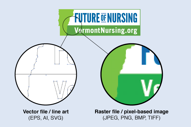
Logo files are formatted in two ways: line art and pixel. We’ve all seen pixelated logos. These fuzzy, hard to read, brand-killing horrors are one of the most flagrant violations of brand management. The way to avoid this is to always use line art files. Line art files (also called “vector” or “EPS”) can be sized up or down with no difference in quality. Pixel-based versions (primarily JPEG format) are extremely limited, and need to be provided at the right size for the resolution at which they are being displayed. Simply put, if you have a 2-inch wide logo JPEG, it should never be displayed any larger, or you’ll risk making a fuzzy impression on your audience.
Logos can appear in multiple sizes and shapes, depending on what looks best for the brand. For example, some companies will opt for a horizontal and vertical version.
Certain audiences may need a tagline, or no tagline, or a different tagline based on region or type of customer. Brand extensions may need different designations or identifiers. Divisions within a company may need a different line of type or color scheme.
Your visual identity is more than just a logo. Achieving and maintaining quality control across all aspects of your brand’s appearance means planning for every vehicle used, specifics of that medium and how those specifics relate to your marketing strategy, brand story, and messaging.
If different creative teams are producing materials for different media, they need strong guidance by your internal marketing manager or at the very least a brand management guide to assure consistency. Every impression of your brand on your customer or audience should be positive and consistent no matter the media—a TV spot should reinforce a print ad, which should reinforce a poster—you get the idea. Read more about overall brand management and consistency here in one of my previous posts.
If you have inherited a mess, or simply suffered through a few lax years, quality control may seem like an insurmountable task with no easy solution. But it isn’t. First, start by identifying the most obvious problems.
Everyone needs to be on board with your brand—employees, contractors and media creative. If you have issues like these, set priorities and take definitive steps to correct each one, then create a policy to prevent similar issues in the future.
The time and effort that goes into documentation of your brand identity and standards will never be wasted. Your brand is your child, your responsibility, your charge. Consider a management guide and a set of approved assets, one point of accountability on staff, and proper vendor selection as the essential nutrients for its growth and maturity.
![]()

The Change Conversations blog is where changemakers find inspiration and insights on the power of mission-driven communication to create the change you want to see.
© 2009- to present, Marketing Partners, Inc. Content on the Change Conversations blog is licensed under a Creative Commons Attribution-Noncommercial-NoDerivs 3.0 United States License to share as much as you like. Please attribute to Change Conversations and link to ChangeConversations.
Creative Commons License may not apply to images used within posts and pages on this website. See hover-over or links for attribution associated with each image and licensing information.

A media call feels urgent — but it usually isn’t. Taking a few minutes to get your bearings can be the difference between a quote you’re proud of and...
Think your communication is always bias-free? Think that you are equally respectful, inclusive and welcoming with a diverse range of people — those...

For the last few decades, but especially so in recent years, people are seeking out more than just an income from their place of employment. More...