 Brad Pettengill
Oops! How to Prevent Bad News Results When the Media Calls
A media call feels urgent — but it usually isn’t. Taking a few minutes to get your bearings can be the difference between a quote you’re proud of and...
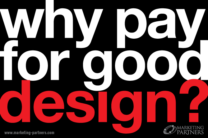

Why should your nonprofit invest in good design? Your mission is pressing, the needs are great — why spend money on design when it seems like it would be better spent on something that has a more direct effect on your customer. Here’s why. Good design is universally understood and people respond to it.
Good design sells. Whatever you’re selling or promoting.
We respond positively to the design and functionality of the latest smart phone, the buildings we live and work in, the car we drive, the clothes we wear, the chair we sit in — so why would good design not be important to the look, feel and functionality of our outreach materials? It is. The better the design, the better the response. Good design and employing best practices for optimal functionality will inspire your visitor to take action, donate, get involved and support your cause.

1. Evocative, On-target Images
A picture really is worth a thousand words. Engage your visitor or customer, draw them in to your message. Whether it’s a delicious visual on the front page of your website, or the front cover of you print catalog or annual report, a well-planned and well-designed visual makes your work easy. Lots of text runs the risk of going unread. A strong visual will always make and impact
A Solid Grid and Clear Eyepath
A disorganized layout or nonexistent grid will leave your visitor or customer wondering where to go, and they could easily just go away. We access information in an organized manner, and eyepath is crucial to conveying your clear message and directing the reader where you want them to go. So good design includes the structure of your message, the grid, the layout. A visitor who has been lead down an easy path to being a customer, a contributor, or a participant will retain a satisfied feeling and possibly become an evangelist for your cause/product.
 Color to Inspire Action
If you want your visitor to know they’re in the right place, your color palette should be harmonious with your brand.Different demographics respond to colors in different ways, color preferences change by audience. Use research to help determine how to best guide your visitor with color, as they gather information and as they make decisions. Certain colors are better than others to inspire action. And certainly good design makes sure your action areas don’t get lost on the page.
Be Mobile Friendly
More and more visitors come to your organization through their smartphone. Ignoring this ever-increasing on-the-go audience means missing out on a significant number of people who could have become customers but left your website after a frustrating experience. Make sure reading, accessing images, ordering, donating or signing up are easy and fun. This requires experience with mobile website coding best practices, not only with design but with planning and execution as well.
Social Media Consistency
If your customer hangs out on Facebook, Twitter, Instagram, YouTube or other platforms, you need to not only inspire them to connect through your website, you also have to have a strong presence on those platforms. How does good design apply? There are several ways to link to social media, whether it’s through pleasing colorful, well-designed icons, or an embedded platform feed that can be customized to work with the look and feel and complement the user’s experience of your site. AND when they arrive at your social media’s page, it should be designed with care and consideration for your branding, so the experience does not alienate or confuse the visitor.
 Make Information Fun
Often you will have a lot of information you need to convey about your nonprofit, public agency or mission-driven business. Whether it’s about populations/demographics served, programs offered, upcoming events, client testimonials, statistics, results/outcomes, budgets, capital campaigns or fundraising goals, the challenge is to use good design to emphasize the right information in the right place at the right time. Make complicated stuff easy to understand. And encourage the visitor to act on the information presented while having fun learning something new. Infographics are the perfect solution.
Be clear about your audience and your project priorities whether you are briefing a design staffer, an outside professional, or talking to yourself. There is a risk of going too far and ending up with a slick, glossy end product that is inappropriate for the audience your nonprofit or public agency is trying to reach.
Why should your nonprofit invest in good design? Invest in good design to advance your mission.

![]()

The Change Conversations blog is where changemakers find inspiration and insights on the power of mission-driven communication to create the change you want to see.
© 2009- to present, Marketing Partners, Inc. Content on the Change Conversations blog is licensed under a Creative Commons Attribution-Noncommercial-NoDerivs 3.0 United States License to share as much as you like. Please attribute to Change Conversations and link to ChangeConversations.
Creative Commons License may not apply to images used within posts and pages on this website. See hover-over or links for attribution associated with each image and licensing information.

A media call feels urgent — but it usually isn’t. Taking a few minutes to get your bearings can be the difference between a quote you’re proud of and...
Think your communication is always bias-free? Think that you are equally respectful, inclusive and welcoming with a diverse range of people — those...

For the last few decades, but especially so in recent years, people are seeking out more than just an income from their place of employment. More...