 Brad Pettengill
Oops! How to Prevent Bad News Results When the Media Calls
A media call feels urgent — but it usually isn’t. Taking a few minutes to get your bearings can be the difference between a quote you’re proud of and...

Whether you’re creating a new page design for your website, an online ad, print brochure or an infographic, many of the same design principles apply. Color choice, use of shapes, and page layout or composition can make or break your marketing’s effectiveness. The difference between putting information on a page and actually making it visually appealing and effective so it works well for your marketing, is a singular focus on visual hierarchy or eye path.
We are inundated with information in all media. Using distinctive design techniques, you want to help walk your visitor through your information and lead them to make an informed decision and take action. You want to give them an easy path to conversion. If your information is well organized, appealing, clean and concise, easy to read and fun, you will be successful. If not, you risk losing your visitor to the more appealing, easier-to-read ad on the page, or the more professionally designed website on their page of Google search results.
Figure out the relative importance of the various areas of content in your message. People read subheads and process visuals much faster than body text, so making use of graphics, color, images and selective accents will allow the reader to either scan the page and still pick up the most important information, or read the entire text if they have been enticed into the forest with comfortable walking paths and enough clearings that they do not fear getting lost in dense underbrush.
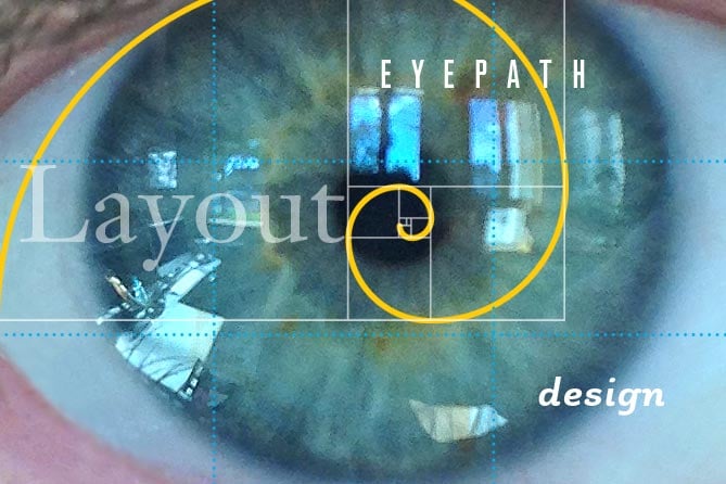
Where do you want to draw the attention of the reader? First, capturing the attention of the reader requires creating an area of focus. This can be done through use of a dominant element that is stronger than other parts of the page, and by placing it in an area we are naturally inclined to look. The dominant element can be a graphic, a photo, even a type graphic. Size, placement, use of color and subject matter all affect its attention-grabbing ability. There are more focal points as the reader is led along the path to action, and the hierarchy of these is established through composition, eye path, size, shape and color.
Composition has many aspects. Symmetry, asymmetry, pattern, texture proportion, shape, line, balance, movement, rhythm, focus, contrast, to name a few. Often your composition will be affected by the proportion and size of your ad, banner, website design theme, photo content, or aspect ratio. There are popular compositional guidelines we humans have created, based on our observations of nature:
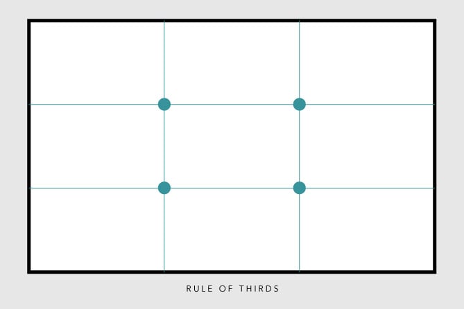
Rule of Thirds Often used in photography, it applies to layout as well. Divide your available space into horizontal and vertical thirds, and you end up with a grid of nine rectangles. Align elements of importance to the right or left third, the top or bottom third. The intersections of right/bottom, right/top, left/bottom and left/top are special focal points that just look right, and make a composition visually interesting.
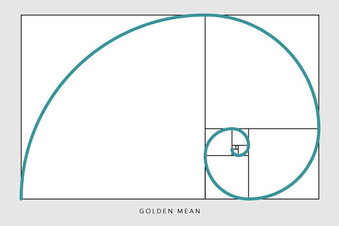
Golden Mean Sometimes called the divine proportion. Used by the Greeks when designing the Parthenon, Davinchi in his drawings of the human form. Mathematically expressed in the Fibonachi sequence, which also describes the spiral of the nautilus, the spiral of the growth patterns in plants, and more. It has been used to determine the proportion of the credit card and other rectangles used in marketing and product design. Good stuff.
Once you’ve captured their attention, where do you want them to go, and what do you want them to do? Lead them through your message to the call–to-action by placing their goal on a natural eye path. For cultures that read left to right, and classic eye path for them runs upper left to lower right. Items not on this path can be missed by the reader, unless another attention-grabbing technique is used, perhaps a bright color, compelling photograph, or exciting video.
But eye path is more than upper left to lower right. It’s about where your customer’s eye goes first, then where it goes after that. And you can control that with design. If the research shows images are an important part of your customer decision making, increasing image size may change eye path and increase sales. Also, people respond to people. Studies show an increase in response to a photo when it features someone’s face. And when the face is looking somewhere, we tend to follow their gaze. Voila! We have directed someone’s eye path.
A balanced layout creates visual harmony and order. An unbalanced layout creates tension. There are many factors that contribute to balance—size, position, spacing of elements, color compatibility or dissonance, shapes, etc. There are no unbreakable rules—your layout can be symmetrical and yet still be unbalanced; and your asymmetrical layout can be a symphony of sporadic elements seemingly randomly placed, yet perfectly balanced. The goal is to create a harmonious thoughtful experience for your customer.
It’s not that there is no purpose for unbalanced work. Sometimes you want to create tension — maybe that inspires the action you are looking for in your particular marketing campaign. In general, though, balance is best. And balance does not mean boring. You can create productive tension in a balanced design.
Put it this way: who would you rather visit and spend time with—your troubled, needy friend with 6 cats who lives in a house with broken windows, sloped floors, and piles of junk everywhere? Or your Rayban-wearing bestie who’s a working, prosperous professional in a nice modern house with a well-balanced lifestyle of physical activity, lively conversation, artistic endeavors and a cool dog? I rest my case.
People react to color in a variety of ways. The psychology of color includes vastly different, demographic-specific preferences. Using the colors that research or testing show as most effective for your target demographic or marketing persona serves to welcome and comfort your desired prospect. They subconsciously know they are in the right place. Using the wrong colors may alienate and confuse them.
Color is also used for impact, attention, and accent. Like the proud peacock’s plumage display, our attention can be drawn to bright colors that stimulate a response. A call to action, for example, should probably not be hidden or subdued by muted colors that recede into the background. The challenge is for these accents to interact harmoniously with your brand identity. Your color usage in your marketing should work well with your brand identity so your message is not obscured by conflicting visuals.
 5. Movement
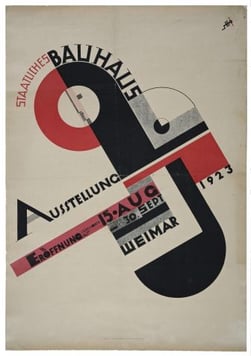
Line, form, shape, type choice, type size, compositional elements, and placement all give a piece movement. If a layout is static, response can be static as well. Dynamic layout and composition makes a page come alive, invigorates, motivates the reader. Symmetry and asymmetry, balance, grid system, angles all play a part in giving a design movement. Here is a classic example of movement in poster design from 1923.
One of the biggest mistakes you can make is to shoehorn all your information into the available space. If a layout has no “white space” or negative space, the eye has no relief from a constant bombardment of information. No relief results in eye fatigue and decline of readership.
We are hardwired to recognize and respond positively to symmetry, repeating patterns and structures that intuitively feel sound. Conversely, chaos and disarray generally inspire a chaotic and confused response. This does not mean that random textures and patterns are not useful in design, it means that generally we are more comforted when the eye sees orderly or familiar arrangements. Because of this the eye will be drawn to orderly arrangements of similar bits of information (like links, or photo thumbnails) and will be comfortable with, and accustomed to accessing that information.
The size, typeface family, choice of italic or roman, normal, condensed or extended, weight, color, leading, kerning, letter-spacing have a huge impact on readability and perception of hierarchical information. Type can be used as a graphic, treated in a way that adds interest to a layout, inspiring readership and contributing to marketing message success. Even within the limits of an established corporate identity’s typestyle guidelines there can be a lot of freedom to affect mood, create interest and excitement, and motivate a response.
Establishing a grid, preferably one using the rules of good composition, helps gives structure to a marketing vehicle. Aligning elements when possible contributes to a sense of order, and allows the eye to move unencumbered through a layout. There is a synergy created when elements in a design align to an invisible grid…the eye discerns the order and clean invisible lines are formed between objects—photos, headlines, subheads, logos, etc.—that line up.
Juxtaposition. Duality. Opposites. Visual irony. Contrast can be achieved through type styling, use of texture, complementary colors, how type interacts with color, or the interplay of ordered, gridded, repetitive and chaotic random textures. There is an energy in the use of contrast in design that corresponds to our life experiences, our responses to light and dark, day and night, dull and sharp, happy and sad. Without contrast, the danger is we live in "...the gray twilight that knows neither victory or defeat" (Theodore Roosevelt). The monotony of the mediocre. The beige minivan of design. Which, no matter how great its safety rating, is the most dangerous marketing vehicle.
When you focus on building an eye path supported by the ten principles of effective design, you can be confident that the most visible component of your marketing strategy is working hard to increase conversions and advance your mission.

![]()

The Change Conversations blog is where changemakers find inspiration and insights on the power of mission-driven communication to create the change you want to see.
© 2009- to present, Marketing Partners, Inc. Content on the Change Conversations blog is licensed under a Creative Commons Attribution-Noncommercial-NoDerivs 3.0 United States License to share as much as you like. Please attribute to Change Conversations and link to ChangeConversations.
Creative Commons License may not apply to images used within posts and pages on this website. See hover-over or links for attribution associated with each image and licensing information.

A media call feels urgent — but it usually isn’t. Taking a few minutes to get your bearings can be the difference between a quote you’re proud of and...
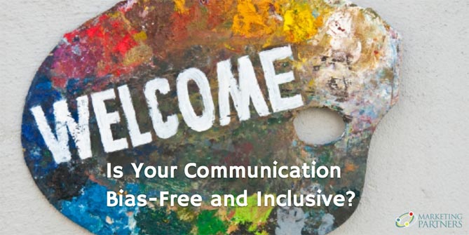
Think your communication is always bias-free? Think that you are equally respectful, inclusive and welcoming with a diverse range of people — those...

For the last few decades, but especially so in recent years, people are seeking out more than just an income from their place of employment. More...