How to Use Your Core Values to Inspire, Retain, and Energize Your Team
For the last few decades, but especially so in recent years, people are seeking out more than just an income from their place of employment. More...


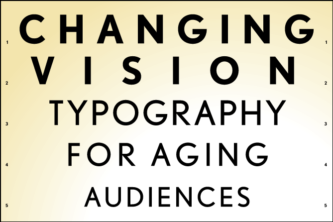
A reader recently responded to my blog post Typeface Choice: Ask yourself Three Questions, by raising an important series of questions on changing vision, information accessibility and type readability for an aging population. The reader works for a nonprofit community support agency that is developing outreach materials for rural seniors, adults with disabilities, caregivers and potential volunteers, and wanted advice on the best typeface to use to “keep the printed conversation going with our target population.”
Having designed for years for clients whose audiences include these groups, and with my wife having been executive director of a volunteer center in Québec, communicating effectively with people of different abilities is close to my heart. And having had considerable vision changes in the last 5 years, I have first-hand experience that has informed my design decisions for print and online work.
If your audience includes people in the growing demographic of over 50 years old, what is the best way to clearly communicate with them? The first, most obvious answer is that basic principles of good design and communication need to be followed. These include:
The additional specifics of designing for an older population’s eyesight limitations are driven by some of the following conditions:
These factors will increasingly affect how we design and construct signage in and on stores, museums, parks and other public spaces, hospitals, roads, airports, train stations and subways; and how we design and format type in brochures, direct mail and other print collateral, websites, online and email advertising, and other electronic communications.
There are some basic rules for type legibility which become even more critical for aging eyes. Think of this as improving information accessibility—the Americans with Disabilities Act (ADA) actually has typeface and design guidelines. Here are a few examples from an ADA spec sheet on specialty signs:
– All letters, numbers and/or symbols shall contrast with their background, either light characters on a dark background or dark characters on a light background. 70% contrast recommended.
– Characters and background shall have a non-glare finish.
– Letterform shall be Gill Sans upper case or other san serif or simple serif letterforms.
– Character Width to Height Ratio between 3:5 and 1:1
– Character Stroke Width to Height Ratio between 1:5 and 1:10
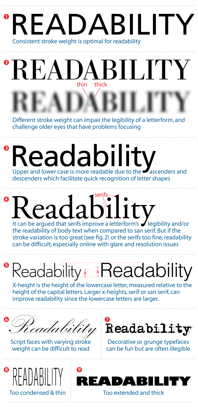
In other words: non-reflective letterforms and symbols should contrast well with their background, the typeface should not be too condensed or too extended, not too thin or thick, or not have thick/thin variation within the structure of the letterforms. A few typefaces that meet these requirements are: (san-serif) Helvetica, Arial, Futura, Gill Sans, Avant Garde, Trebuchet, Verdana, Franklin Gothic, VAG Rounded, Frutiger, and (serif) Garamond, Century Schoolbook, Glypha. Some of these fonts are also standard typefaces on the web, for good reason. A backlit screen presents readability issues that parallel those of older eyes—excessive glare, focusing difficulty, lack of contrast, too much or too little light—so typeface choice is even more critical in electronic display communications materials for aging eyes.
 Various considerations on type readability for aging audiences
First of all, there are generally two ways we use type, headline and body text. Headlines are larger, shorter and more quickly and easily read than body text. Since body text is longer and smaller, extra care must be taken when formatting it for aging eyes. Some guidelines: 12-14 point minimum size, with liberal leading (line spacing). Make sure line lengths are no more than 2-1/2 alphabets (65 characters). Flush left, ragged right (instead of justified) allows the eye to find the next line easily. And traditional typographic wisdom holds that serif typefaces are easier to read in long blocks of text. However, some of the above recommendations for ease of readability may seem to conflict with this. There is an ongoing debate on this issue, challenging traditional wisdom, asking whether serif readability is a myth, especially in light of the age of backlit screens surpassing ink-on-paper readership.
Good design and readability don’t have to be mutually exclusive. Tiny strings of letterspaced type can be attractive design elements, but if they can’t be read by your 50- or 60-year old customer, they’re useless. Instead, the designer must create beauty AND readability, and there are many options to accomplish this while accommodating the needs, physical challenges and comfort level of an aging population. I see these recommendations not as limiting, but an opportunity to be inclusive, to attract more people. Some of the best design is big, bold, beautiful and unmistakably clear, and those qualities make your message appealing to people of all ages.

The Change Conversations blog is where changemakers find inspiration and insights on the power of mission-driven communication to create the change you want to see.
© 2009- to present, Marketing Partners, Inc. Content on the Change Conversations blog is licensed under a Creative Commons Attribution-Noncommercial-NoDerivs 3.0 United States License to share as much as you like. Please attribute to Change Conversations and link to ChangeConversations.
Creative Commons License may not apply to images used within posts and pages on this website. See hover-over or links for attribution associated with each image and licensing information.

For the last few decades, but especially so in recent years, people are seeking out more than just an income from their place of employment. More...

You know nonprofit organizations need websites just as small businesses do, but you may be surprised to learn nonprofit sites can be more complex and...

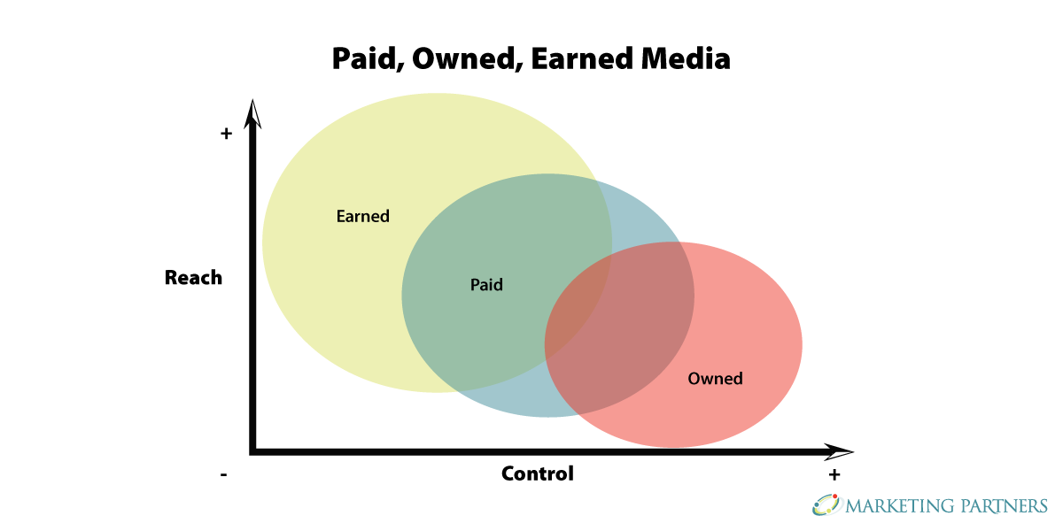
In today’s rapidly evolving media landscape, understanding where and how your story is told isn’t just strategic—it’s essential. How you communicate...