 Karen Wilkinson
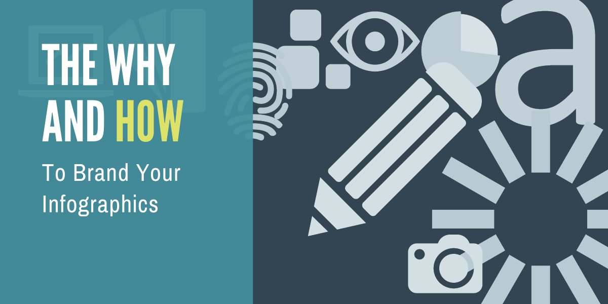
Oops! How to Prevent Bad News Results When the Media Calls
A media call feels urgent — but it usually isn’t. Taking a few minutes to get your bearings can be the difference between a quote you’re proud of and...
 The current wave of infographic usage is only gaining momentum. From social media to corporate reports and even the evening news, you’re seeing these information graphics everywhere. They are a visually appealing package of pictures, numbers and words that can tell us the all-important facts in an instant. It’s the perfect content condiment to spice up your message and help your audience digest the data.
If you’re not already using this ultra-effective way of communicating with your audience, it’s time to jump on board. Let’s recap the five main reasons why infographics are the way to go for you and your brand.

The brain can process images 60,000 times faster than it does text1. Infographics have become more popular and commonplace as the current information torrent shows no signs of abating. So much to read and so little time means everyone is looking for a faster way to consume all this content — and as the saying goes “a picture is worth a thousand words”. Infographics attract attention, along with helping our brains understand and retain the information.

More visuals, images and videos are the standard, and you know how social media posts are far more likely to be shared when there is a visual element included. Images also break up larger sections of text, creating more comprehensible and interesting blog posts, newsletters, reports, web pages, or any other content vehicle.
Infographics, in particular, are known to be the most engaging content types in social media being shared three times more than any other form of content.2

Or on a more formal note, infographics aid retention of the information. Initially, the overall appeal of a well-designed infographic draws the reader in, then our brains automatically find the visuals both engaging and effective. The graphics, colors and messaging combined also have an emotive aspect, which deepens the retention of the content. The overall message has made its mark and can be easily recalled. This is success by all measures.

It is a reality that cannot be ignored: the appearance and visual style of presented information plays a subconscious role in how you assess it. If the document or material looks like it has been created and designed by professionals who know what they are doing, it gives both the content and organization more gravitas. The inclusion of infographics shows effort and understanding, plus a more effective experience for the viewer.

Everyone should put their brand up in lights, and this is an ideal way to do it. The clever infographic design is one that incorporates your fonts, colors and iconography style, rolled into a neat package that also showcases industry-leading and up-to-date information. Presenting facts and figures in a polished infographic format reinforces you as a thought leader on the given topic.
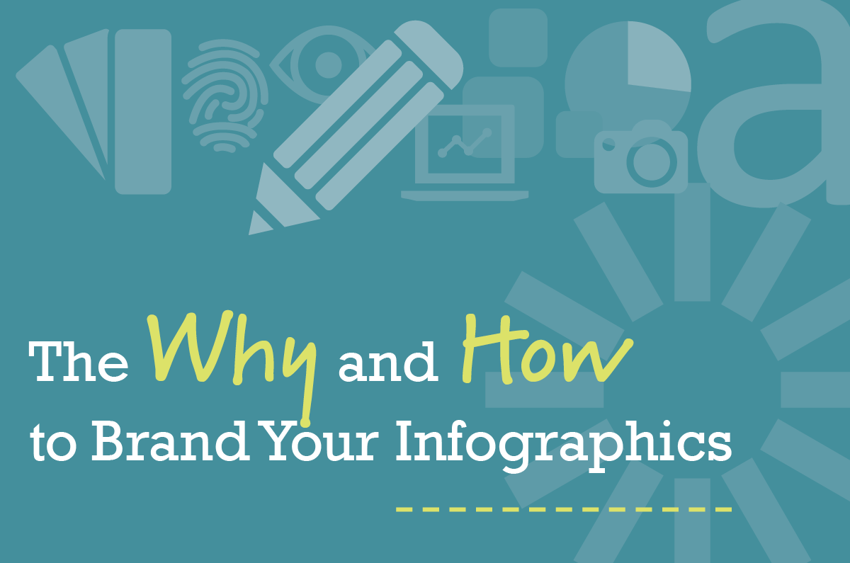
Let’s look at reason number five in further detail and break down how to extend your branding into your own, unique infographics style.
Your branding extends from your logo and visual appearance through to the actions of your company and employees, and everything in-between.
![]()
Here is a quick recap on what your brand is, as well as how to build and maintain your corporate identity.
The main areas to consider for extending your branding to infographics are:
A good example of corporate branding extending to infographics:
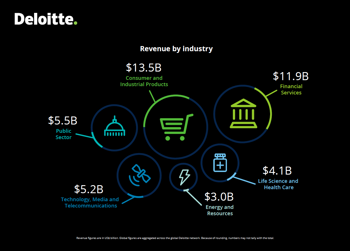 Source: Deloitte 2018 Global Impact Report
Deloitte launched their major rebrand in 2016, to create a more consistent international presence, and, as described by Deloitte senior MD of its global brand, Amy Fuller, "We are building on the strong foundation of our existing brand identity, and making an investment in Deloitte’s future growth and development as the leadership brand in professional services."
Let’s look at Deloitte’s updated branding elements as examples of how to create engaging infographics, such as the one above.
A limited color palette is imperative. Use your primary branding colors and identify a secondary palette, if you don’t already have one, of complimentary colors that are used repeatedly. You may be tempted to introduce other colors from time to time, but this will weaken your brand recognition and dilute the messaging. Stay strong, repetition is king!
The Deloitte primary color palette consists of the green dot, plus a black and white version of the logo. The secondary palette includes bright blues and other greens.
Your font style speaks to your audience in your already-established tone. Much time, effort and consideration went into the initial design and selection of your corporate fonts. Use these font families, and perhaps select just one, or at the most, two more to add a human or conversational element–depending on your audience.
A style that looks hand-rendered or more casual can be useful for call-out information or small areas of text. It can have the effect of someone explaining this section to you and differentiates it from the hard data.

Your own branding has an image style that works for larger communication pieces, and a derivative can be developed for infographics. Iconography is popular to illustrate the topics/areas being presented, and there is still scope for differentiation within this.
The icons in the Deloitte example below have rounded end points and relatively thin lines to make up the graphics. The width of the lines in a chosen iconography style need to be consistent on every single usage, to become a well-defined extension of your branding. Whether they are large or small, the icon width should be the same, meaning that re-sizing alone does not work for creating materials of different sizes.
![]()
The example below from Pew Research uses simple graphs and photography, which are suited to their audience of news reporters and policymakers.
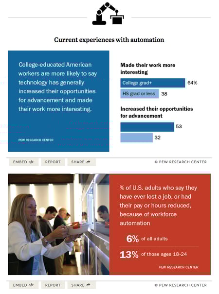
Source: Shareable facts on Americans’ views and attitudes toward automation technologies
This illustration style from lifehack.org is vastly different, along with the font usage. It’s ideally suited for the broader audience and relatable topic.

Source: Why Sitting is Killing You
The tone can also be thought of as the personality of your brand, for example: friendly, serious, contemplative, welcoming, cutting-edge, etc. Composition is the layout or arrangement of the elements. These two areas can be intertwined, as together they tell the story of your brand.
Another Deloitte example below uses ample negative space and a clean, corporate-looking layout to convey the message. It is styled to look professional and (hopefully!) convey their position as a market leader.
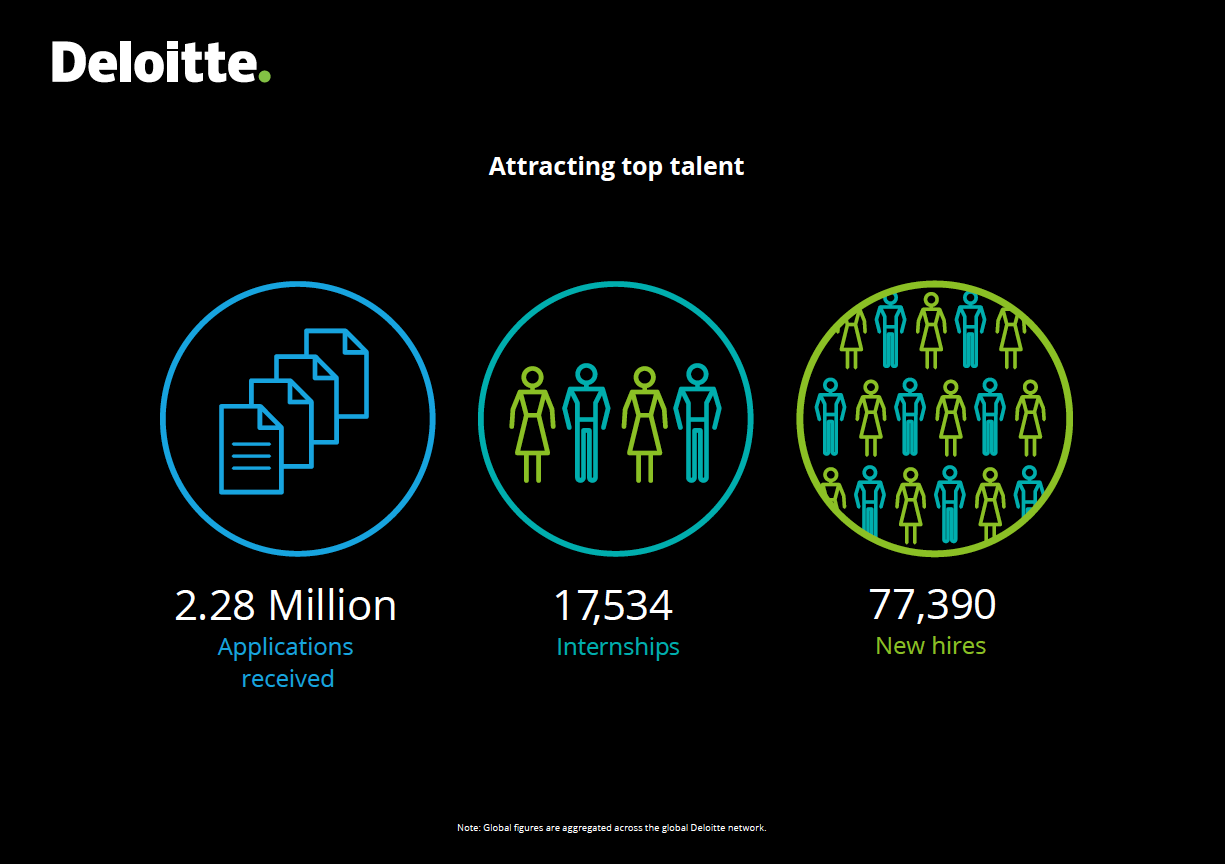 Source: Deloitte 2018 Global Impact Report

In real estate you hear, “location, location, location!” In the branding world, it’s “consistency, consistency, consistency!”
Embrace your branding guidelines and never stray from this blueprint. Your consistent use of these elements will create the recognition and retention your insightful infographics deserve.
Focussing on these areas will allow to you confidently create your own infographics and have them become the asset they are intended to be.
If you’re thinking you don’t know where to start, that’s not a problem. Briefing the designer(s) who developed your logo and style guidelines is the perfect starting point or using one of the many template-style options that exist online will give your team the tools to do it yourself. Check out How to Create a Fantastic Infographic, which includes our top four sites to help you create your own.
These tips all add up to your target audience receiving your message in a more efficient, effective, enjoyable, professional and consistent way. Not to mention the added benefit of simplifying important information into attractive, bite-size chunks everyone loves to share.
1 Visual Marketing: A Picture’s Worth 60,000 Words (Business2Community)
2 Magic Ingredients: 25 Great Examples of Infographics Done Right
![]()

The Change Conversations blog is where changemakers find inspiration and insights on the power of mission-driven communication to create the change you want to see.
© 2009- to present, Marketing Partners, Inc. Content on the Change Conversations blog is licensed under a Creative Commons Attribution-Noncommercial-NoDerivs 3.0 United States License to share as much as you like. Please attribute to Change Conversations and link to ChangeConversations.
Creative Commons License may not apply to images used within posts and pages on this website. See hover-over or links for attribution associated with each image and licensing information.

A media call feels urgent — but it usually isn’t. Taking a few minutes to get your bearings can be the difference between a quote you’re proud of and...
Think your communication is always bias-free? Think that you are equally respectful, inclusive and welcoming with a diverse range of people — those...

For the last few decades, but especially so in recent years, people are seeking out more than just an income from their place of employment. More...