 Intern Blogger

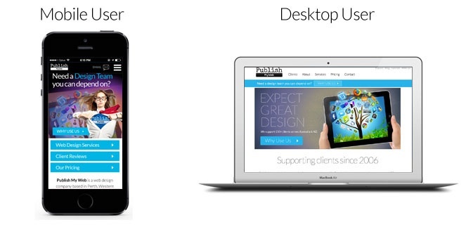
.png?width=692&name=Why%20and%20How%20to%20Optimize%20Your%20Website%20for%20Mobile%20(3).png "How to Optimize Your Website for Mobile")

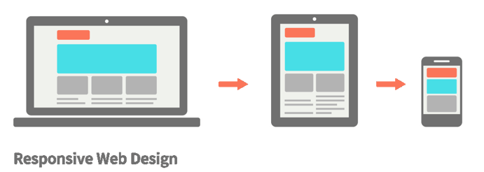
.png?width=691&name=mobile-first-webdesign-022-1024x689%20(1).png "mobile-first-webdesign1024x689")


Oops! How to Prevent Bad News Results When the Media Calls
 Pat Heffernan: Jul 9, 2026
A media call feels urgent — but it usually isn’t. Taking a few minutes to get your bearings can be the difference between a quote you’re proud of and...

 Hiro Soga