 Intern Blogger
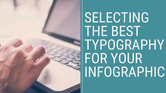
Oops! How to Prevent Bad News Results When the Media Calls
A media call feels urgent — but it usually isn’t. Taking a few minutes to get your bearings can be the difference between a quote you’re proud of and...
 You sit down at your computer to develop an infographic and couldn’t be more excited to share it with your mission driven audience. Then you suddenly remember you’re not a designer. Not to worry. In the online world today, nearly anyone has access to free graphic design software and tools to create an infographic. Unfortunately, the increase of free design tools has created an increase in badly designed infographics, and poor typography is often the reason. Your goal is to reach the right audience with the right message at the right time — a poorly designed infographic will be a big fail.
I'm defining an infographic as a visual image used to present information or data you want to leave a lasting impression on your audience. So, why use infographics?
We are naturally visual beings. That means we are more likely to be inspired by images rather than big paragraphs of text. In fact, 40 percent of people respond better to visual aids than plain text. In addition, including infographics in your social media posts creates a higher potential of going viral. Bit Rebels, a technology news site, found tweets that contain infographics are retweeted 832 percent more than standard tweets.
With thousands of fonts to choose from, it can feel like an overwhelming challenge to select the most effective one for your infographic. Picking the right font might be one of the most important but least considered parts of designing effective infographics.
So, how can you be sure the typography for your infographics is the most appealing? Here are a few guidelines to get you started.
There are three main font families: serifs, sans serifs, and display fonts. Each font family has different purposes and common uses among designers.
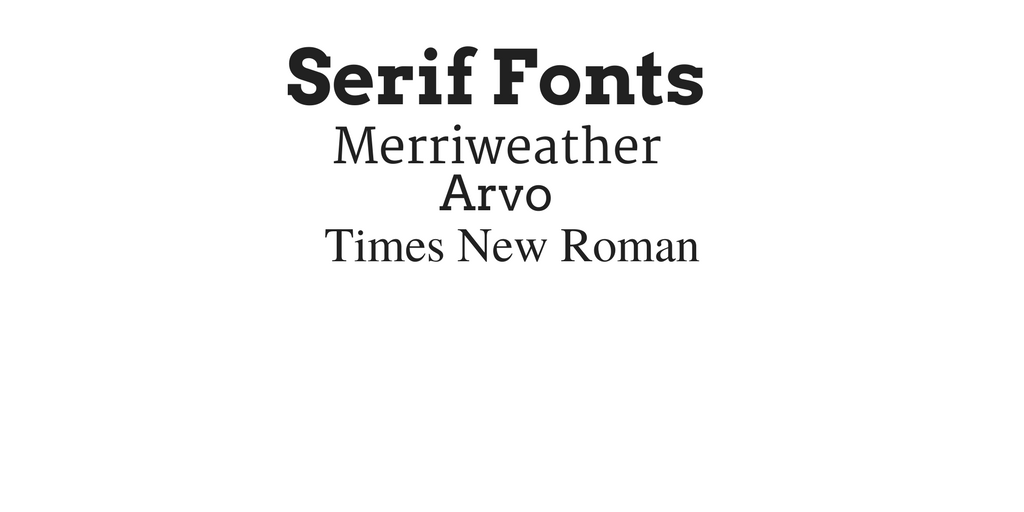
Serif Fonts: This type of font is described as having small lines attached to the letters; the embellishments are called “serifs”. Time New Roman and Merriweather are popular examples of serif fonts.
When should they be used?
A common theme is using serif fonts as a body text because it’s easier to read. Our eyes are accustomed to reading Times New Roman, because it’s the font type that usually appears in books and newspapers. Therefore serif fonts are usually characterized as being “easier to read”.
.png)
Sans Serif: When translated from French, san serif actually translates to “without serifs”. Meaning this type of font doesn’t have lines or embellishments. Popular fonts include Helvetica, Lato, and Arial.
When should they be used?
Sans Serif fonts are usually best for section headers, captions, lists, and titles in your infographic.
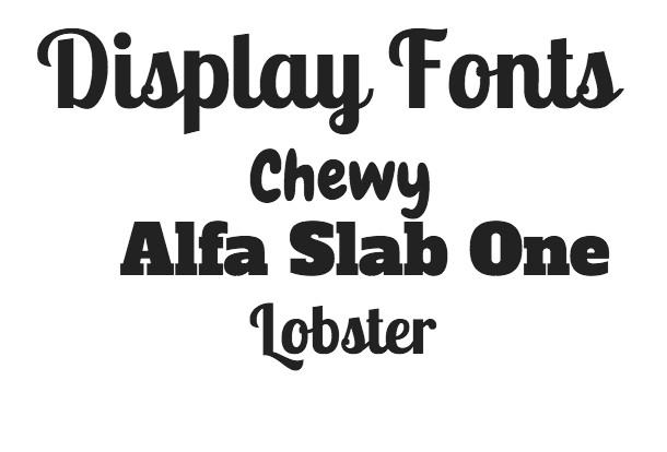
Display Fonts: Display font is a family of fonts that are usually
more playful by design. It can include cursive or handwriting
fonts that are meant for a specific type of design.
When should they be used?
Designers agree display fonts should really just be used as headers to set the mood and theme of your design. Some popular display fonts are Alfa Slab One, Lobster, and Chewy.
There are millions of options when choosing a font. Experienced graphic designers have developed strong preferences for pairing fonts and deciding which ones to use and not use. Try using a tool like Font Pair, which offers designer suggested font pairings.
The next step is to think about the theme of your infographic. What tone are you trying to convey? Are you trying to inspire or inform? It’s important that your font matches the theme you want to convey to your audience.
For example, if the purpose of your nonprofit were to share information to an English as a second language (ESL) audience, than using a professional or simpler font on your infographic would be more beneficial, this approach is easier to read and understand.
It helps to take a look at other infographics to form and develop your thematic design.

This is an example of an infographic where the author uses sans serif fonts throughout. The result is a very futuristic and informational design that complements the topic: encouraging battery recycling for our planet's future.
Design alignment refers to how you place similar elements in proximity to one another. Poor alignment makes for a poorly designed infographic that can be distracting to look at.
When you’re in the design process it is important to remember these tips:
Be sure to position and align the same types of elements together, body text, headers, graphics, etc.. If you have three sections with a header and body text, each header should be aligned with the other headers, and the same goes for the body text. Additionally, there should be an equal amount of space between each section.
Below is an infographic that demonstrates attractive alignment.

When creating effective infographics it's important to remember that the best way to get better at design is to practice. No one’s first design is their best ever, but with practice and these few tips you’ll be creating effective infographics in no time!
--------------
Alyssa Keeler is a senior at Saint Michael’s College specializing in Business and Media Studies. Originally from New York, after spending time abroad in Spain she hopes to continue her marketing career in an international environment.

![]()

The Change Conversations blog is where changemakers find inspiration and insights on the power of mission-driven communication to create the change you want to see.
© 2009- to present, Marketing Partners, Inc. Content on the Change Conversations blog is licensed under a Creative Commons Attribution-Noncommercial-NoDerivs 3.0 United States License to share as much as you like. Please attribute to Change Conversations and link to ChangeConversations.
Creative Commons License may not apply to images used within posts and pages on this website. See hover-over or links for attribution associated with each image and licensing information.

A media call feels urgent — but it usually isn’t. Taking a few minutes to get your bearings can be the difference between a quote you’re proud of and...
Think your communication is always bias-free? Think that you are equally respectful, inclusive and welcoming with a diverse range of people — those...

For the last few decades, but especially so in recent years, people are seeking out more than just an income from their place of employment. More...