 Brad Pettengill
Oops! How to Prevent Bad News Results When the Media Calls
A media call feels urgent — but it usually isn’t. Taking a few minutes to get your bearings can be the difference between a quote you’re proud of and...
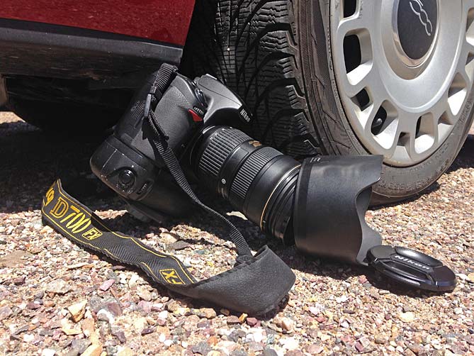
You need strong images for your marketing campaign and you've decided to use photography as the best way to evoke an emotional response, build your brand and effect change in the hearts and minds of your audience. Whether you're creating images for your blog or website, social media, or shooting high-end product photos, here are 5 common mistakes you'll want to avoid.
In the words of the great photojournalist Robert Capa, "If your photographs aren't good enough, you're not close enough". If your desired subject is too far way, or there is too much irrelevant or unnecessary detail, your viewer may not know where to look, or they may not understand what you’re trying to say. Cluttered photos with no clear focal point can cause the viewer confusion and agitation. If your photo is unbalanced, it can create tension. Sometimes that can be intentional, but most of the time it's just bad composition. And yet a seemingly centered, balanced subject may be too static. Volumes have been written about what makes a great composition, e.g., the Rule of Thirds, the Golden Ratio, etc. but the bottom line is, your image needs to be clear. You want to pull people in, not make them go away. Most of the time, less is more.
A blurred, out-of-focus image looks amateurish, and even the smallest amount of camera motion can make your photo subjects lack clarity, especially in their facial features—eyes, smile, etc. Lack of sufficient resolution (either from using a low-res camera or smart phone, or by cropping an image) can also create less than razor-sharp images and may even result in pixellation. There are a few exceptions to mistake number 2: trying to create the illusion of motion; intentionally using short depth-of field to selectively focus on one small part of your image; using blurred images for artistic effect.
The key to harmonious imagery is balanced lighting, and perfect exposure is an art that requires a good eye, sensitivity to subtle details and mastery of your equipment. Sometimes an "automatic exposure" camera setting does not give you the effect you want, or concentrates on the wrong area of the shot when calibrating exposure, causing your desired subject to be too dark or too bright. Intentional over or under-exposure can be used to create an emotional effect, evoke a mood or perception but if not done well it will just look like a bad photo. Other lighting issues to avoid are: harsh shadows (unless that adds to your intended mood or serves another purpose), red-eye (caused by on-camera flash that is too close to your lens, reflecting the back of a person's eye directly back into the lens), lens flare (lighting source or sunlight reflecting on the lens surface), and unintended reflection (mirrors, windows and metal surfaces are the worst offenders, but your light source can reflect unflatteringly on anything—walls, ceilings, etc—creating hotspots that make your photos look unprofessional).
If your photo is plain and uninspiring, if it lacks a spark of insight into someone's personality or a hint of magic about your product, it could bore your audience into turning the page or clicking the back button, or inspire them to check out your competition. Your photos are the messengers that inform your customers about your brand. Without words they tell the story of your product, your cause, your service, your idea. Most of us have a built-in authenticity detector. If the people in your photo are not being genuine, their poses are contrived, or the composition or subject matter is clichéd, your audience will respond with lack of interest, or worse, an unfavorable lasting impression of your company.
You want to inspire someone to act, give them a reason to respond. If your photo does not achieve this goal, perhaps it's because the subject matter is wrong, the imagery does not appeal to your target audience, or it does not tell your brand’s story. Maybe there is no clear message, and ambiguity is not conducive to an effective marketing campaign. If you want to be a change agent, stay on target with your message and your images.

![]()

The Change Conversations blog is where changemakers find inspiration and insights on the power of mission-driven communication to create the change you want to see.
© 2009- to present, Marketing Partners, Inc. Content on the Change Conversations blog is licensed under a Creative Commons Attribution-Noncommercial-NoDerivs 3.0 United States License to share as much as you like. Please attribute to Change Conversations and link to ChangeConversations.
Creative Commons License may not apply to images used within posts and pages on this website. See hover-over or links for attribution associated with each image and licensing information.

A media call feels urgent — but it usually isn’t. Taking a few minutes to get your bearings can be the difference between a quote you’re proud of and...
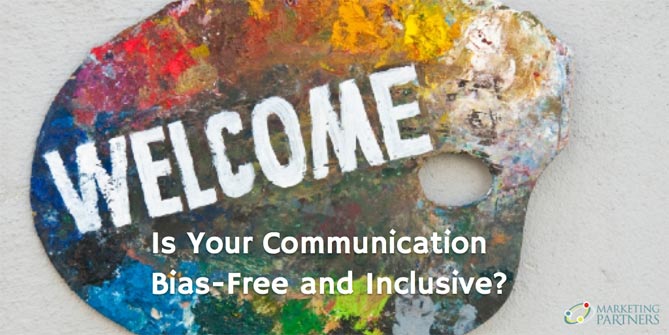
Think your communication is always bias-free? Think that you are equally respectful, inclusive and welcoming with a diverse range of people — those...

For the last few decades, but especially so in recent years, people are seeking out more than just an income from their place of employment. More...