 Brad Pettengill
Is Your Communication Bias-Free and Inclusive?
Think your communication is always bias-free? Think that you are equally respectful, inclusive and welcoming with a diverse range of people — those...
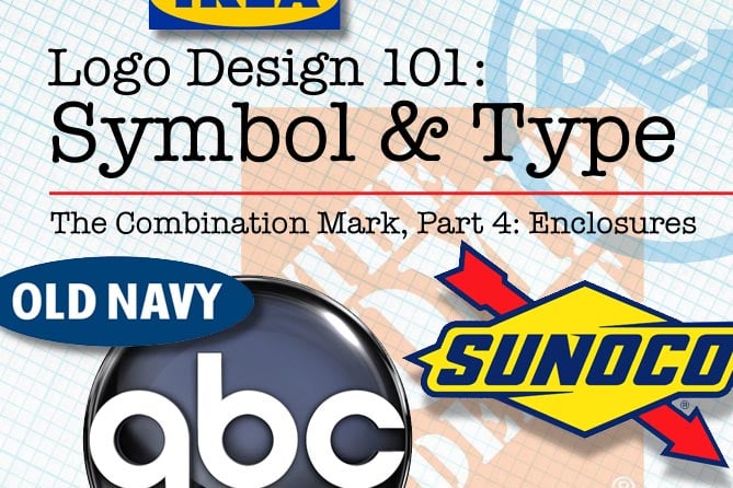

Logo Design 101: The Combination Logo, Part 4: Enclosures
In this article 7 of the series, Logo, Corporate Identity or Brand—What's the Difference?, we continue looking at combination logos—designs that feature type and symbol—with a focus on enclosures. An enclosure logo is, basically, type within a shape. As I gathered these enclosure logos, I was surprised at the number of multi-billion-dollar mega companies that use this seemingly super-simple approach. At times my reaction to such simplicity has been something like, "this is the world's largest [insert industry here] corporation…and they're using Helvetica inside a circle. And they probably paid a design firm hundreds of thousands of dollars. Wow. I guess the emperor left his clothes in that boardroom."
Don't get me wrong, I understand simplicity and clarity. Usually, the best design for a logo is clean and beautiful. It may appear to those not involved in its creation an obvious strategic choice and easy to create. And that's the point. That's the impression that the consumer should have from a great logo—a brand story clearly and simply stated, in visual language unencumbered by unnecessary distractions and details. Few people know, or care, that the backstory of this shining icon of perfection is a sweaty conference room littered with hundreds of sketches, rejected ideas, typeface options, color studies and design refinements that resulted from hours of meetings, voluminous research, brainstorming and a few empty coffee cups.
That said, I am still sometimes disappointed that it all boils down to Helvetica inside a circle. And from the murky haze of my disappointment two choices emerge: Either I continue to smugly pontificate about the folly of mega-corp design by committee that chokes the creative life out of everything, dumbing down design and underestimating the ever-increasing sophistication of today's consumer, or I open my mind to the possibility that I don't know everything, and am still teachable. After finishing the research for this post, I boldly choose the latter (with some exceptions). I need to be open to the possibility that all the hard work, research and intelligence that creates and builds a successful company is also there during the logo design and selection process. Again, I remind myself, simple is better. And, as a designer prone to perfectionism, I know that within a simple enclosure design there can be a fair amount of complex design decision-making, including color choice, typography of the company name, the historic, archetypal, or societal meaning of shape and symbols, and considerations such as scale, proportion, and relative size of the elements. And that's just the logo design. How that deceptively simple design is used in the implementation of a company's corporate identity can add a lot of depth to the company's image, and is essential to the impact of the brand on the consumer.
So enough of my rant. Here are a few examples of enclosure logos. I have arranged them by shape, ranging from circle to ellipse to rectangle, square and more complex shapes.
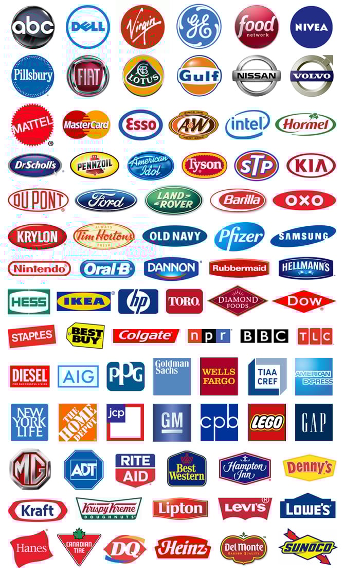 The enclosure logo effectively tells the brand story with judicious choice of typography, color, shape and styling.
What I find fascinating is how the logos that have almost identical design elements, like the angled ovals of Samsung and Pfizer, or the Gulf, Nissan and Volvo marks, still maintain a distinct look and feel. A few of these marks have small graphic elements that inform and support the brand—swirls, a bell, ribbon, some parsley, a maple leaf, flourishes and abstract symbols—but most rely solely upon enclosure shape, typography, color, and styling. As I finished compiling, sorting and arranging these, I found I had a new appreciation of the time-honored tradition of enclosure logo design. 82 logos, simple shapes, basic colors. All different, all active, viable, traditionally successful industry leaders. It's a beautiful thing. And the emperors are fully clothed.
My pure design appreciation does not address the implications of choosing an enclosure logo for one of our upstart, break-the-rules, values-based clients. For such a client, an enclosure logo could be neither boring nor brilliant but disastrous if it evokes deep advertising-induced memories of traditional mega-corporations.

![]()

The Change Conversations blog is where changemakers find inspiration and insights on the power of mission-driven communication to create the change you want to see.
© 2009- to present, Marketing Partners, Inc. Content on the Change Conversations blog is licensed under a Creative Commons Attribution-Noncommercial-NoDerivs 3.0 United States License to share as much as you like. Please attribute to Change Conversations and link to ChangeConversations.
Creative Commons License may not apply to images used within posts and pages on this website. See hover-over or links for attribution associated with each image and licensing information.
Think your communication is always bias-free? Think that you are equally respectful, inclusive and welcoming with a diverse range of people — those...

For the last few decades, but especially so in recent years, people are seeking out more than just an income from their place of employment. More...

You know nonprofit organizations need websites just as small businesses do, but you may be surprised to learn nonprofit sites can be more complex and...