 Karen Wilkinson
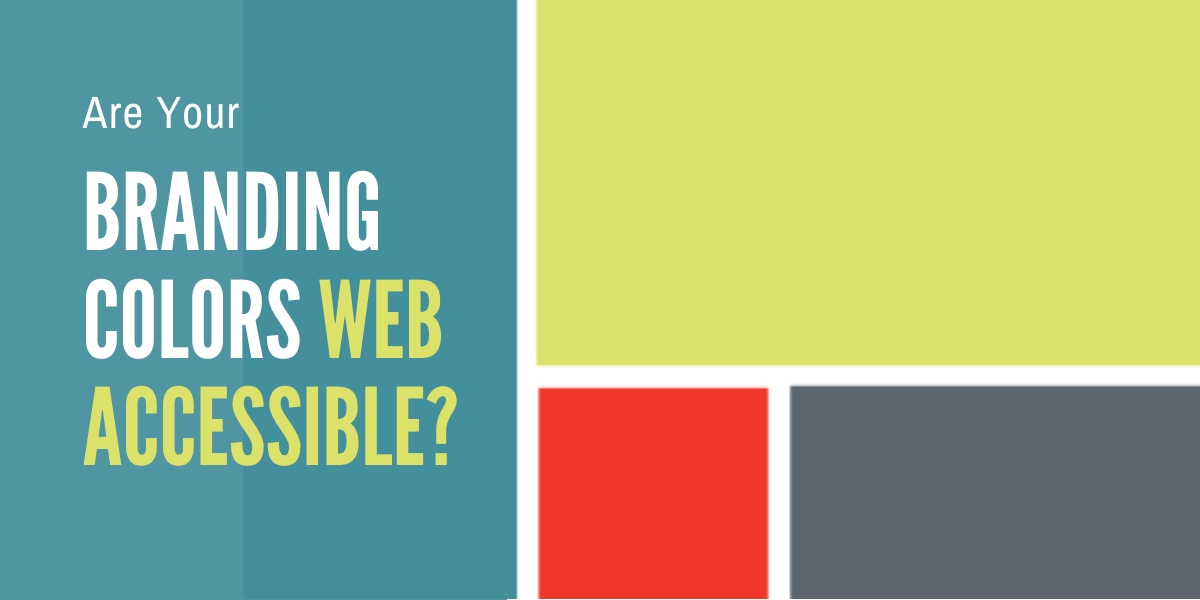
Is Your Communication Bias-Free and Inclusive?
Think your communication is always bias-free? Think that you are equally respectful, inclusive and welcoming with a diverse range of people — those...

Consistency is king when it comes to using your branding colors across all mediums, including your website. But designing for legibility and readability across all mediums can be a neglected or unexpected challenge. Have you ever tested your color usage for an acceptable contrast rating for accessibility? Let's look at how to do this, plus some simple steps to ensure your color contrast ratio will always meet accessibility standards.
Digital accessibility is ensuring information can be reached, used and understood by any person, on the wide range of digital devices we have available.
The principles and basic requirements of the accessibility challenge and why web accessibility matters to you and your business were discussed in previous articles. There are billions of people worldwide who experience some kind of impairment due to reduced vision, hearing, motor or cognitive abilities.
In terms of vision alone, the statistics are incredible.
There are … over 2.2 billion people who have a vision impairment around the world, but more than 70 percent of all websites are inaccessible to them.
Susanna Zaraysky, Content Strategist, Material Design, Google1
Is your website one of those that are inaccessible? It very well could be but this is simple to rectify. For vision impairment, a high color contrast assists legibility and there are now multiple ways to test this.
Through considered website development and design, websites can be accessible for all. This should be the goal for every organization and entity online, and fortunately this conversation is becoming more amplified. It has long been best practice to adhere to the World Wide Web Consortium (W3C) accessibility guidelines, which produces extensive benefits, including improved SEO results.
It's an easy win-win to optimize your content for search engines and accessibility.
How and what you write for assistive-technology users also improves how you rank with search engines, such as Google or Bing, which can drive more traffic to your website.
Stanford University2
Today I am focusing on your online branding colors. For more information on other aspects of online accessibility, visit w3.org/WAI/test-evaluate and perhaps bookmark the page as a thorough resource and excellent checklist.
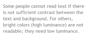
As with color blindness, if the condition doesn’t affect you, you may not realize the importance. We exist in an extremely visual world with messages relayed to us constantly, much of the time via digital screens. When text is displayed on a background color that is similar to the text color, or even a lighter shade of the same color, it can be impossible for some viewers to distinguish the shape of the letters.
An example from W3C of a common issue on websites, with low-contrast gray text on white.
A high color contrast is when the text color is nearly opposite that of the background color, for example, white text on a black background. This is why you will see closed captioning on television monitors in this style, to increase accessibility, particularly in public spaces.

The symbol for Closed Captions which uses a high contrast ratio.
W3C has a list of resources for testing your color contrast ratio. If you use Photoshop, Adobe Exchange has a plugin available: Check Contrast Ratio.
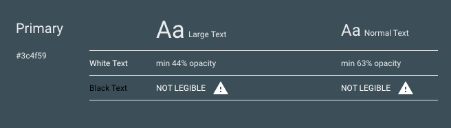
In the example below, I used the Google Color Tool3 and decided to test our own Marketing Partners branding colors. It’s easy to use by simply entering the hex color value. The results were interesting!
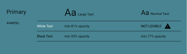
The color contrast results from testing the Marketing Partners teal color.
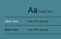 The results indicate that large text in both black and white is acceptable on the teal background, with white being the preference.
 With smaller or normal size text, the color white does not have enough contrast for legibility, while black does.
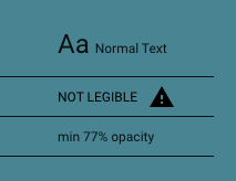
The color contrast results from testing gray with white and black text.
Gray is a common color on websites and the above test results show that white text is legible as both larger text and normal size, while black is not. It's helpful to take into consideration the weight of the font also, such as bold or light, along with the size. This is standard practice for our Marketing Partners website where we continually evaluate legibility.
You can also test your own web pages using a screen reader or other assistive technologies.
Involve people who have visual or other impairments in the development and/or testing of your website. Listen to their feedback and implement functionality to address their needs. With thoughtful implementation your branding colors can still evoke the tone and personality of your identity, while keeping the message clear for all.
This creates success for everyone, those who require accessible sites, along with others who will now find the content and interaction wonderfully simple and efficient to use. Your efforts to ensure digital accessibility will bring mountainous rewards. To perfectly sum it up:
The power of the Web is in its universality.
Access by everyone regardless of disability is an essential aspect.
Tim Berners-Lee, W3C Director and inventor of the World Wide Web5
2 https://med.stanford.edu/web/websites/seo---accessibility-quick-guide.html
3 https://material.io/resources/color/#!/?view.left=1&view.right=1
4 https://www.w3.org/WAI/test-evaluate/preliminary/#contrast
5 https://www.w3.org/standards/webdesign/accessibility
![]()

The Change Conversations blog is where changemakers find inspiration and insights on the power of mission-driven communication to create the change you want to see.
© 2009- to present, Marketing Partners, Inc. Content on the Change Conversations blog is licensed under a Creative Commons Attribution-Noncommercial-NoDerivs 3.0 United States License to share as much as you like. Please attribute to Change Conversations and link to ChangeConversations.
Creative Commons License may not apply to images used within posts and pages on this website. See hover-over or links for attribution associated with each image and licensing information.
Think your communication is always bias-free? Think that you are equally respectful, inclusive and welcoming with a diverse range of people — those...

For the last few decades, but especially so in recent years, people are seeking out more than just an income from their place of employment. More...

You know nonprofit organizations need websites just as small businesses do, but you may be surprised to learn nonprofit sites can be more complex and...