 Dave Bowers
Oops! How to Prevent Bad News Results When the Media Calls
A media call feels urgent — but it usually isn’t. Taking a few minutes to get your bearings can be the difference between a quote you’re proud of and...

Good printing prepress file preparation takes time. In the era of digital design, prepress work looks deceptively easy. Making sure your files are print ready takes time to do well. Integrated marketing campaigns that combine traditional and digital materials can be ruined during their launch by poor quality print work or an error. Unlike a digital design, your sloppy printed piece is time consuming and costly to correct, reprint and ship back out for distribution.

Comps are now done with the look of final art. Gone are the charcoal, watercolor, and pencil art sketches used to present design concepts. Now we are often likely to email or post a PDF of a concept to discuss on Slack rather than make a presentation board and present the concept in person. This can create a misperception.
Modern software tools give a finished, polished look to even the roughest ideas, which requires less imagination and make-believe to visualize the finished product. Because of these very polished preliminary drafts, it seems like the production of a final file once a concept has been approved should take only minutes — but it doesn’t.
There are hours of work to take a digital concept to finished print product. For example, we have a checklist with twenty-eight steps to produce a final 4-color print ad from an approved design. While none of this is the fun and creative part of the process, it is necessary to deliver a quality print-ready advertising file for production in a magazine or newspaper.

Most of the steps in our advertising print production checklist are simple and normal creative production workflow. Some are the result of experience earned on how to make a file most likely to be compatible for any print publication and reduce the risk of unintended color shifts and “drop outs”.
We clearly separate the proofing from the design function. It’s important to have a set of “fresh eyes” view the files. Here's a favorite digital example of why making the time for separate proofing steps is important - we got a chuckle when we ran across this ad on a wind (ahem) industry website.

Editor's Note: This post was originally published in May 2017 and has been updated for freshness, accuracy, and comprehensiveness.
![]()

The Change Conversations blog is where changemakers find inspiration and insights on the power of mission-driven communication to create the change you want to see.
© 2009- to present, Marketing Partners, Inc. Content on the Change Conversations blog is licensed under a Creative Commons Attribution-Noncommercial-NoDerivs 3.0 United States License to share as much as you like. Please attribute to Change Conversations and link to ChangeConversations.
Creative Commons License may not apply to images used within posts and pages on this website. See hover-over or links for attribution associated with each image and licensing information.

A media call feels urgent — but it usually isn’t. Taking a few minutes to get your bearings can be the difference between a quote you’re proud of and...
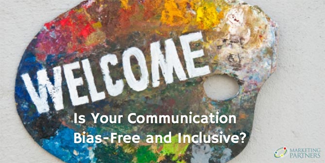
Think your communication is always bias-free? Think that you are equally respectful, inclusive and welcoming with a diverse range of people — those...

For the last few decades, but especially so in recent years, people are seeking out more than just an income from their place of employment. More...